Wild & Precious
Optimal Living
Wild & Precious
Optimal Living
Wild & Precious
Optimal Living
Wild & Precious
Optimal Living
Wild & Precious
Optimal Living
BRANDING | WEB | PRINT
BRANDING | WEB | PRINT
BRANDING | WEB | PRINT
BRANDING | WEB | PRINT
BRANDING | WEB | PRINT
Wild & Precious Optimal Living is a chiropractic practice devoted to help their practice members improve their quality of life through neurologically-based chiropractic. Inspired by Mary Oliver's poem "The Summer Day", the owner of the practice derived the practice's name in hopes to spark motivation in fellow practice members to seek their innate potentatial to live their life optimally. I had the opportunity to develop and design this up-and-coming practices' overall brand image, spanning from their logo creation, web design, print collateral, and interior design.
Wild & Precious Optimal Living is a chiropractic practice devoted to help their practice members improve their quality of life through neurologically-based chiropractic. Inspired by Mary Oliver's poem "The Summer Day", the owner of the practice derived the practice's name in hopes to spark motivation in fellow practice members to seek their innate potentatial to live their life optimally. I had the opportunity to develop and design this up-and-coming practices' overall brand image, spanning from their logo creation, web design, print collateral, and interior design.
Wild & Precious Optimal Living is a chiropractic practice devoted to help their practice members improve their quality of life through neurologically-based chiropractic. Inspired by Mary Oliver's poem "The Summer Day", the owner of the practice derived the practice's name in hopes to spark motivation in fellow practice members to seek their innate potentatial to live their life optimally. I had the opportunity to develop and design this up-and-coming practices' overall brand image, spanning from their logo creation, web design, print collateral, and interior design.
Wild & Precious Optimal Living is a chiropractic practice devoted to help their practice members improve their quality of life through neurologically-based chiropractic. Inspired by Mary Oliver's poem "The Summer Day", the owner of the practice derived the practice's name in hopes to spark motivation in fellow practice members to seek their innate potentatial to live their life optimally. I had the opportunity to develop and design this up-and-coming practices' overall brand image, spanning from their logo creation, web design, print collateral, and interior design.
Wild & Precious Optimal Living is a chiropractic practice devoted to help their practice members improve their quality of life through neurologically-based chiropractic. Inspired by Mary Oliver's poem "The Summer Day", the owner of the practice derived the practice's name in hopes to spark motivation in fellow practice members to seek their innate potentatial to live their life optimally. I had the opportunity to develop and design this up-and-coming practices' overall brand image, spanning from their logo creation, web design, print collateral, and interior design.
CLIENT
CLIENT
CLIENT
CLIENT
CLIENT
Wild & Precious
Optimal Living
Wild & Precious
Optimal Living
Wild & Precious
Optimal Living
Wild & Precious Optimal Living
Wild & Precious Optimal Living
SERVICES
SERVICES
SERVICES
SERVICES
SERVICES
Branding
Web
Print
Branding
Web
Print
Branding
Web
Print
Branding
Web
Print
Branding
Web
Print
YEAR
YEAR
YEAR
YEAR
YEAR
2019
2019
2019
2019
2019
LOGO
LOGO
LOGO
LOGO
LOGO
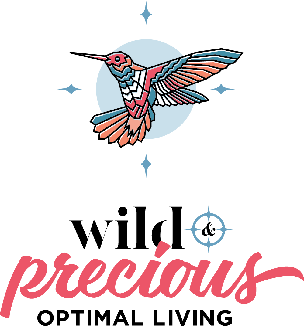
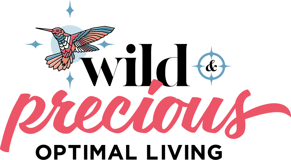
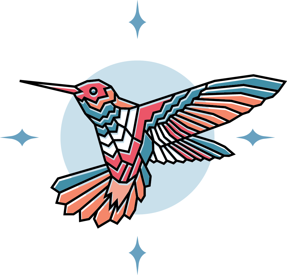
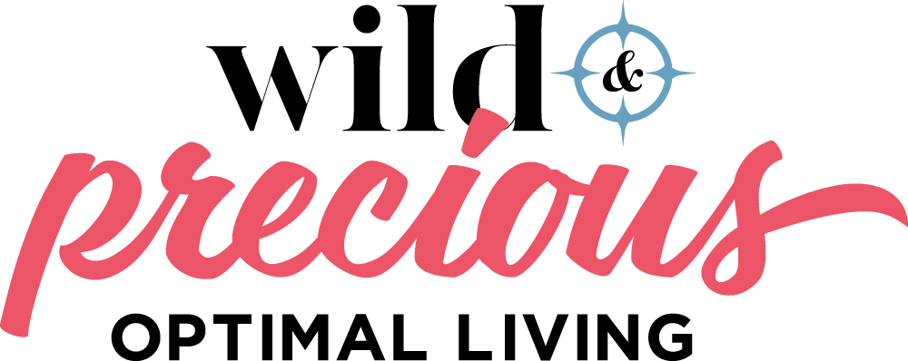
The Wild & Precious Optimal Living logo uses a hummingbird as its primary logo identity, symbolizing healers bringing good luck, love, and joy. Elements of a compass was incorporated to symbolize navigating through one's life.
In addition to using a vibrant yet welcoming color palette, the logotype combines a modern serif and a playful script typeface to evoke its own unique identity, even as the logotype stands on its own.
COMPRESSED LOGO
COMPRESSED LOGO
LOGOMARK
LOGOTYPE
COLOR PALETTE
COLOR PALETTE
COLOR PALETTE
COLOR PALETTE
COLOR PALETTE
In addition to the Wild & Precious logo, the derived palette is also carried across digital assets, print collateral, as well as the interior of the chiropractic practice space.
VIVACIOUS ROSE
EB5668
EB5668
SUNSET ORANGE
F58869
SUNRISE PEACH
F2A491
SPIRITED BLUE
C9DEE8
C9DEE8
CLARITY CERULEAN
CLARITY CERULEAN
69A1BF
69A1BF
SEA TURQUOISE
428FA7
TYPOGRAPHY
TYPOGRAPHY
TYPOGRAPHY
TYPOGRAPHY
The logotype is composed of three different typefaces. The font family of the typeface used for the tagline "Optimal Living" is also used across all print collateral
The logotype is composed of three different typefaces. The font family of the typeface used for the tagline "Optimal Living" is also used across all print collateral
LOGO TYPE: MADE CANVAS
LOGO TYPE: MADE CANVAS
LOGO TYPE: MADE CANVAS

LOGO TYPE: CARPENTER
LOGO TYPE: CARPENTER

BODY TYPE: GOTHAM

WEBSITE
WEBSITE
WEBSITE
WEBSITE
WEBSITE
While following the practice's brand personality and guideslines, the website boasts both form and function for its visitors. The main goal for the website is to educate its visitors on neurologically-based chiropractic and how the Wild & Precious team can help people from all walks of life.
While following the practice's brand personality and guideslines, the website boasts both form and function for its visitors. The main goal for the website is to educate its visitors on neurologically-based chiropractic and how the Wild & Precious team can help people from all walks of life.
While following the practice's brand personality and guideslines, the website boasts both form and function for its visitors. The main goal for the website is to educate its visitors on neurologically-based chiropractic and how the Wild & Precious team can help people from all walks of life.
Check it out live!
Check it out live!
Check it out live!
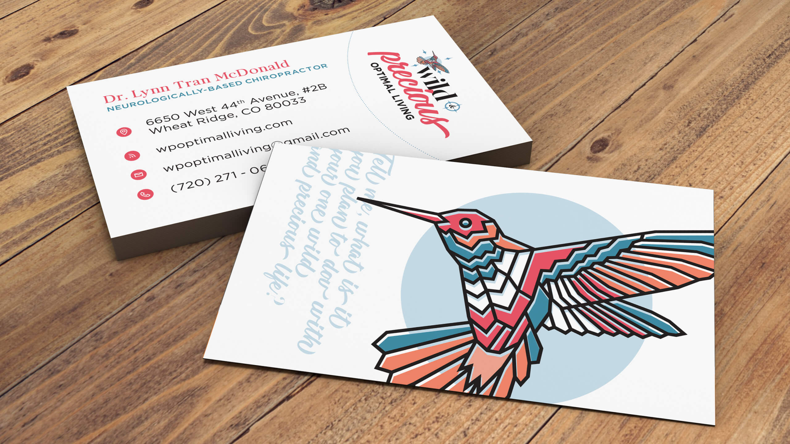
The business card incorporates a quote from the poem that was inspiration for the name of the practice.
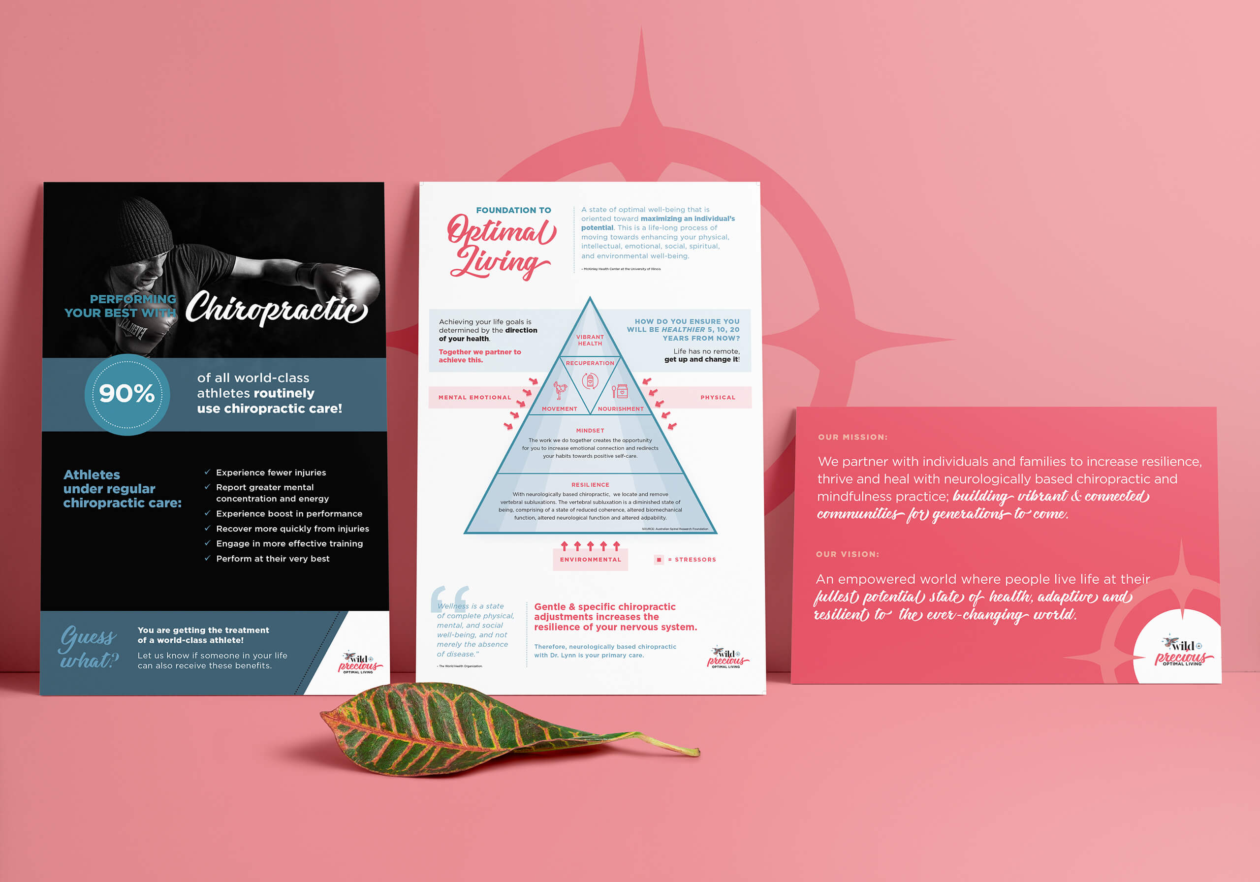
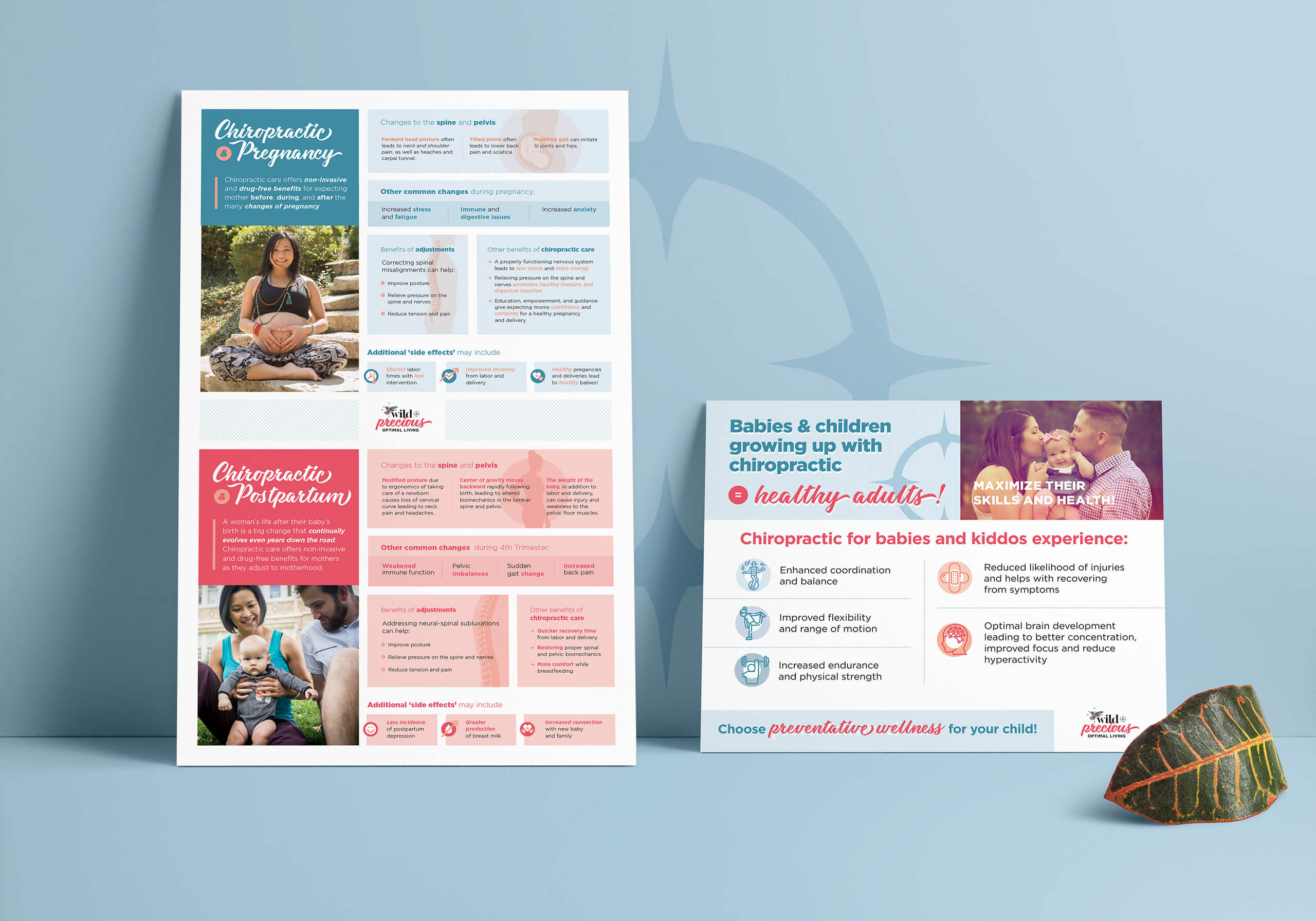
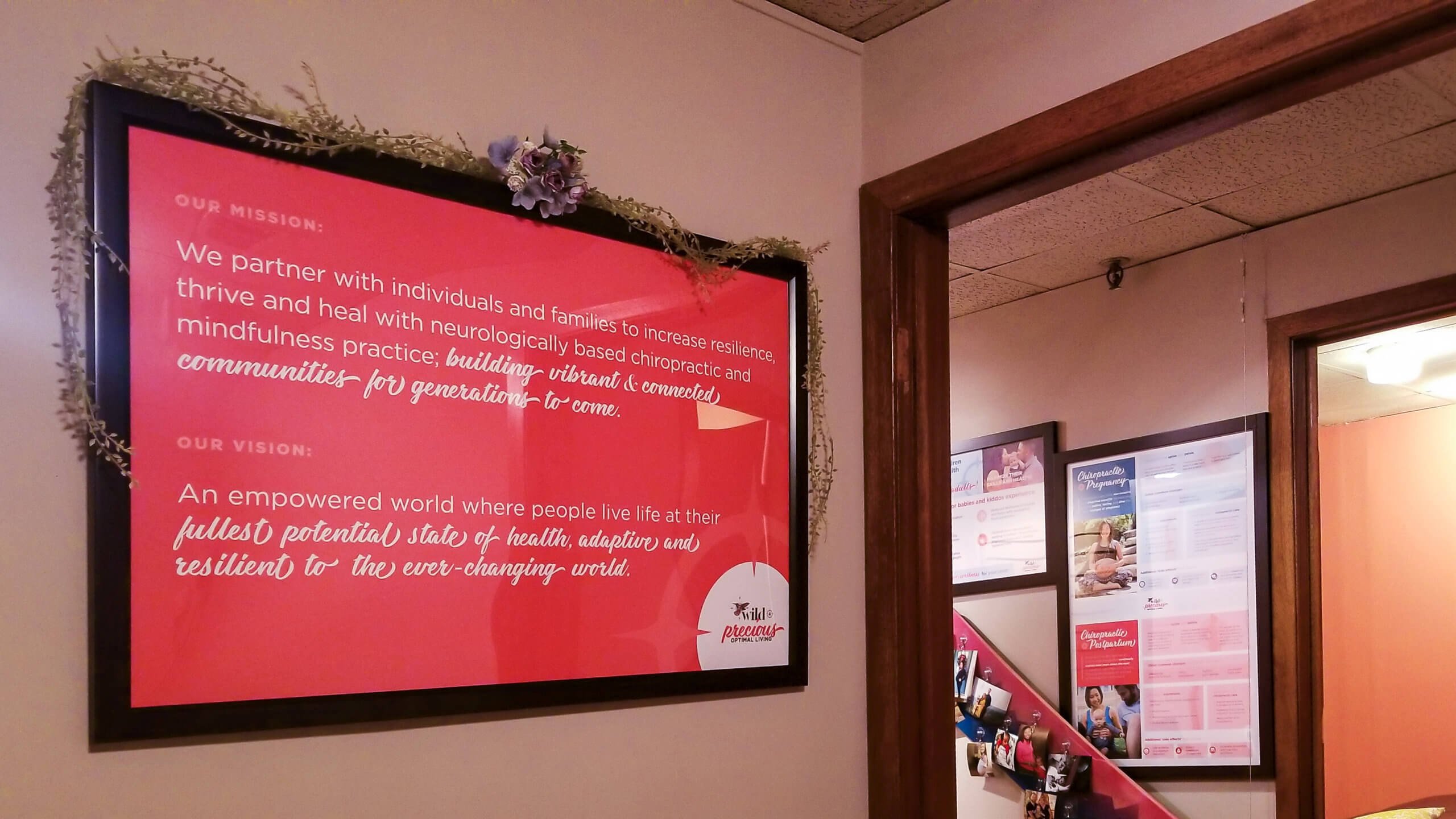
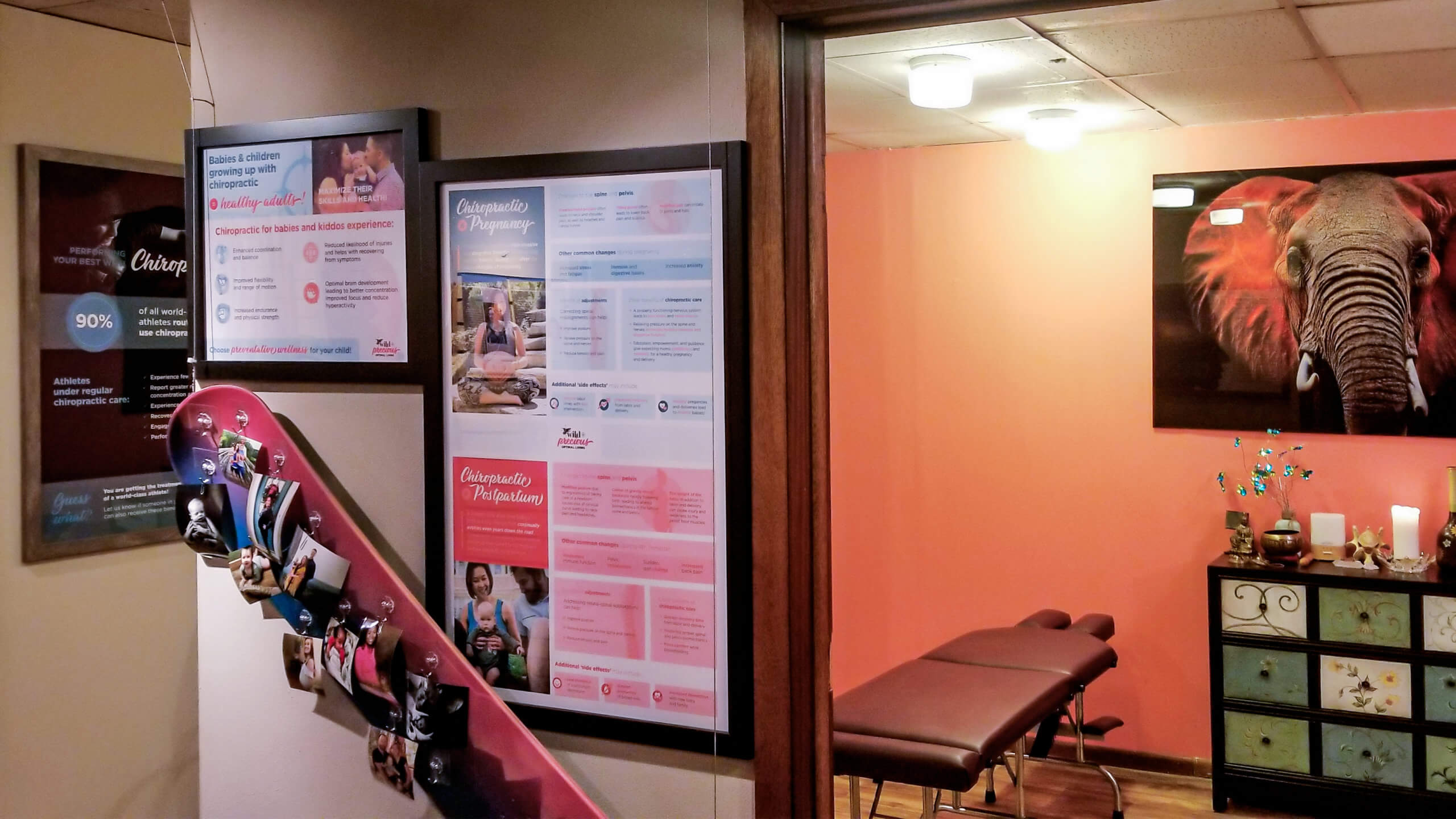
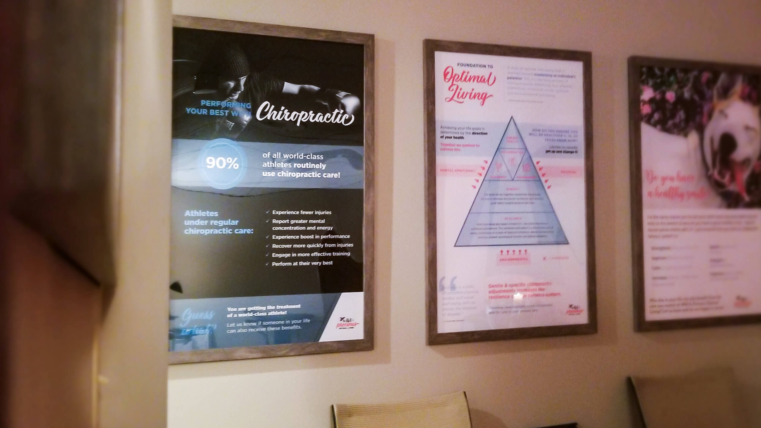
Additionally, a variety of posters were created to be hung around the practice to educate visitors. While each poster had its own unique content and layout, the Wild & Precious brand guidelines was used to provide cohesiveness across all print materials.
Real-life Application
Real-life Application
Real-life Application
Real-life Application
HAND
LETTERING
HAND
LETTERING
HAND
LETTERING
HAND
LETTERING
HAND
LETTERING
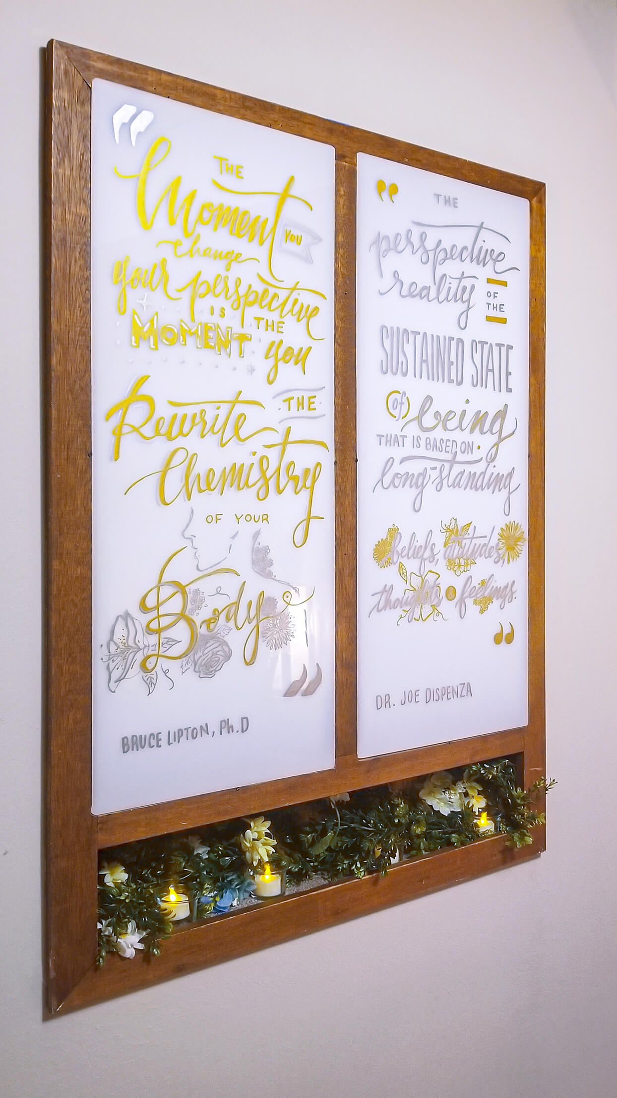
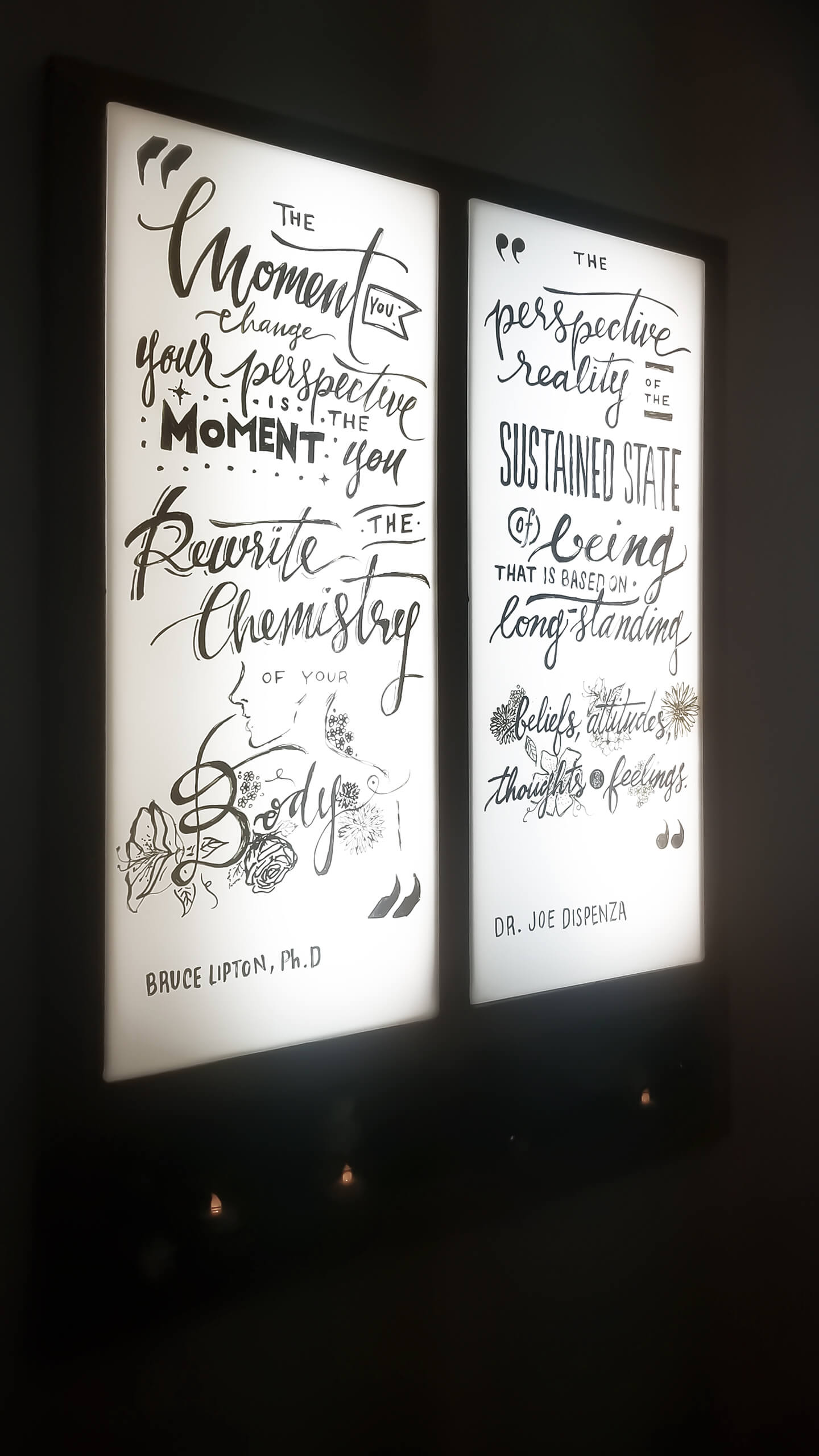
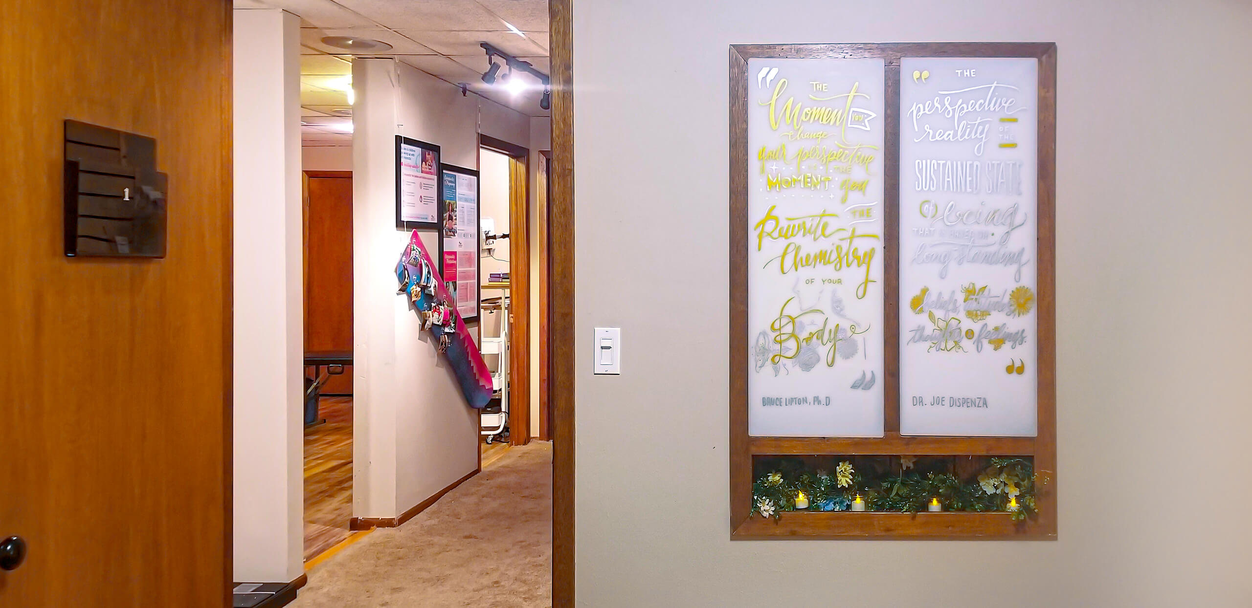
In one of the rooms, there was an x-ray lightbox that was installed by the previous owners. Aside from providing a source of light to the rooms, the new owner struggled to find an esthetique solution to utilitize this box, as there was no intention to use it. Using different handlettering styles, I wrote inspirational quotes chosen by the owner, transforming the lightbox into a unique design element into the rest of the space.
MORE PROJECTS
D Custom InfographicsDigital Infographic

Texas AggieCover Design
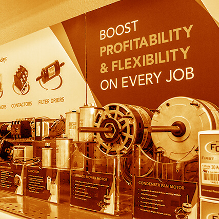
Lennox News: Green IssuePublication Redesign
Wild & Precious Optimal LivingBranding, Web Design,

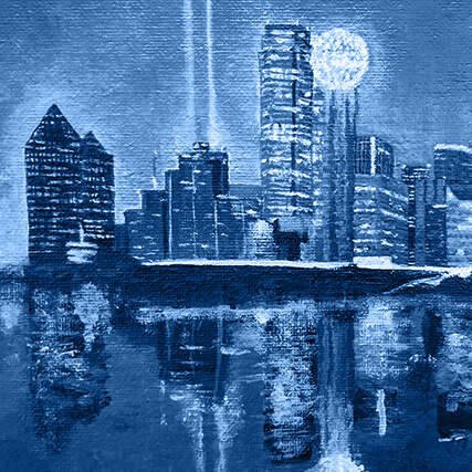
Dallas InnovatesWeb Design
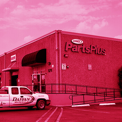
Lennox PartsPlus Store RebrandBranding
Healthy Climate & FirstChoiceBranding
Cezanne QuartetBranding